In today’s fast-paced world, public gathering spaces—whether libraries, community centers, museums, or event venues—serve as essential hubs for connection, collaboration, and cultural exchange. As these environments welcome people from diverse backgrounds and age groups, their interior design must strike a balance between functionality and emotional resonance. Among the most influential design elements? Color and comfort.
The Psychology of Color in Shared Spaces
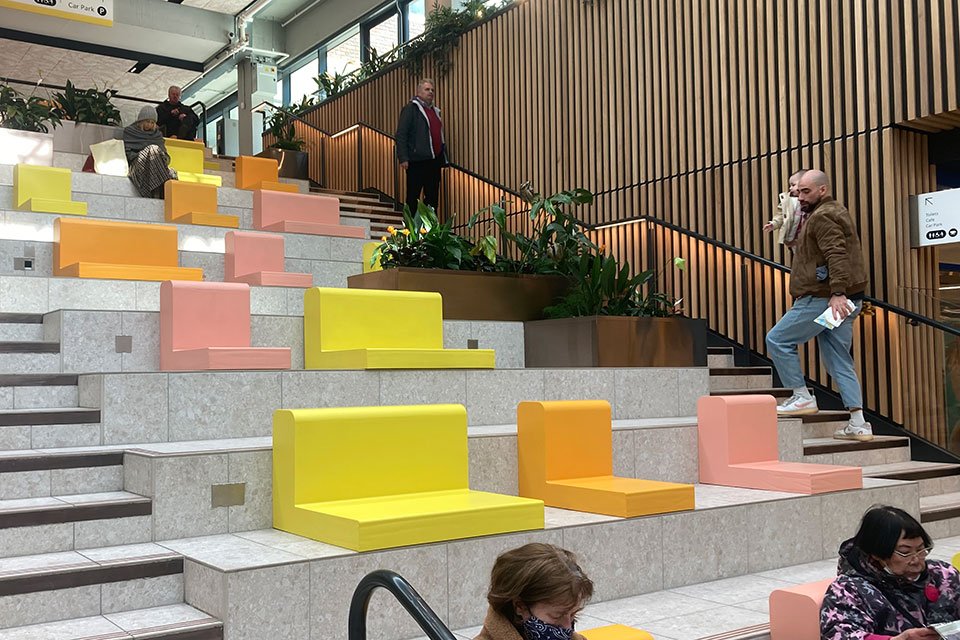
Color isn’t just decoration—it directly impacts human mood and behavior. In public spaces, it plays a pivotal role in setting the tone for engagement, calm, creativity, or even focus.
- Warm colors like soft reds, oranges, and yellows encourage energy, socialization, and warmth, making them ideal for interactive zones or casual seating areas.
- Cool colors such as blues and greens evoke calmness and are commonly used in quiet zones like reading rooms or meditation spaces.
- Neutral tones help create balance and prevent visual overstimulation, allowing for thoughtful contrast with artwork, signage, or furnishings.
By strategically applying color psychology, designers can enhance emotional comfort while subtly guiding visitor behavior throughout a space.
Comfort Through Thoughtful Design
Public spaces aren’t one-size-fits-all. Comfort is about more than soft seating—it’s about accessibility, inclusivity, and sensory ease. Key design features that enhance comfort include:
- Ergonomic furniture that accommodates people of all ages and physical needs
- Acoustic design to minimize echo and control noise levels, especially in multi-purpose halls
- Temperature and lighting control to create environments that are neither too harsh nor too dim
- Wayfinding elements that reduce confusion and improve ease of navigation
When people feel physically and emotionally at ease, they’re more likely to engage fully with the space and with one another.
Aesthetic Cohesion Builds Identity
A well-designed space tells a story. Public interiors that have a cohesive aesthetic—from color palettes to materials and lighting—communicate purpose and intention. Whether it’s a community center celebrating local art or a modern library integrating natural tones to promote tranquility, the overall aesthetic strengthens the space’s identity and creates a lasting impression.
The Impact on Community Engagement
Design that prioritizes color and comfort doesn’t just look good—it builds community. People are more likely to return to, participate in, and care for spaces that feel welcoming and inspiring. For municipalities, institutions, and designers, this translates into greater usage, stronger local pride, and better long-term sustainability.
Final Thoughts
In the design of public gathering spaces, color and comfort aren’t optional—they’re essential. They impact how people feel, interact, and remember a space. As we continue to redefine the role of shared environments in our cities and communities, let’s ensure that aesthetics are not just beautiful, but meaningful and inclusive. Visit Design Arc Interiors.